
Are.na Case Study
Redesigning Are.na to make their collection making process easier.
Examining and redesigning existing Are.na flows
Role:
Product designer
Methods and Skills:
User research, brand systems, Figma, user flows, prototyping
Product designer
Methods and Skills:
User research, brand systems, Figma, user flows, prototyping
How do we make the Are.na’s current curation process smoother?
Are.na, an app intended to help create unbiased collections, currently lacks features that prevents the user from having a fluid collection making experience. Images on mobile are hard to preview due to the grid display, there are no filtration options to get to the content you want, and there’s no smooth way to add something to your collections.
Research
To gather further research, I conducted a survery on the surveying platform Usertesting. In my survey, I asked the user to complete certain tasks in order to gain an understanding of where a problem is occuring during a process and when it’s occuring.
I was able to conclude from the results that
︎︎︎ Users aren’t able to smoothly sift through the content that they searched for due to the grid layout, creating frustation.
︎︎︎ Users had difficulty searching for specific types of content (image, video, and text) because no feature for that function exists on the mobile app.
︎︎︎ Users had no confirmation from app that
their collection(s) were updated.
Solutions
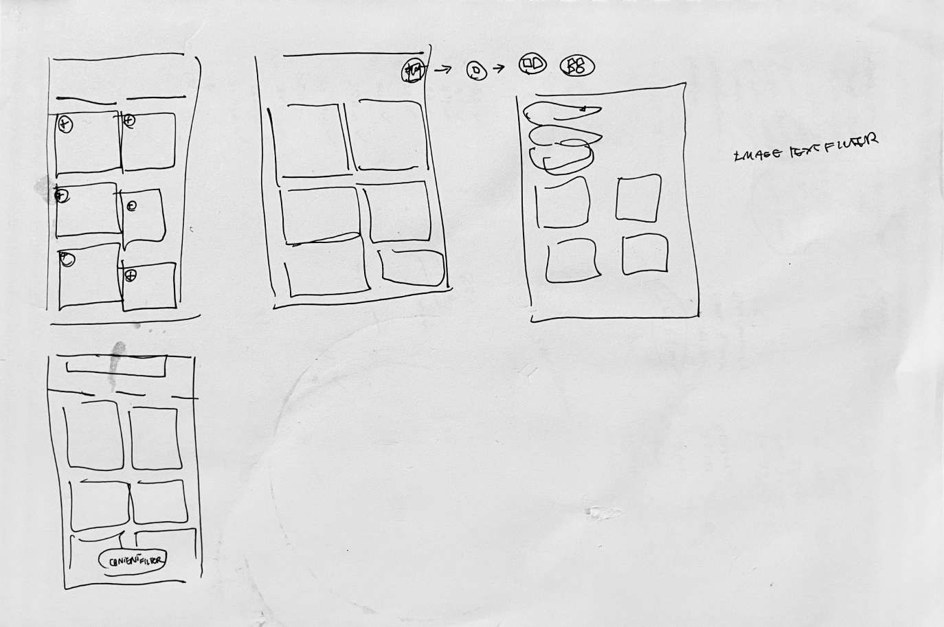
Low fidelity sketches
Initial sketches just to get my ideas onto paper.
01
Solution One:
Enlarging Feed View Button
Enlarging Feed View Button
Gives the user the option to change from two column grid to a one column grid, so blocks can be viewed in better detail.

02
Solution Two:
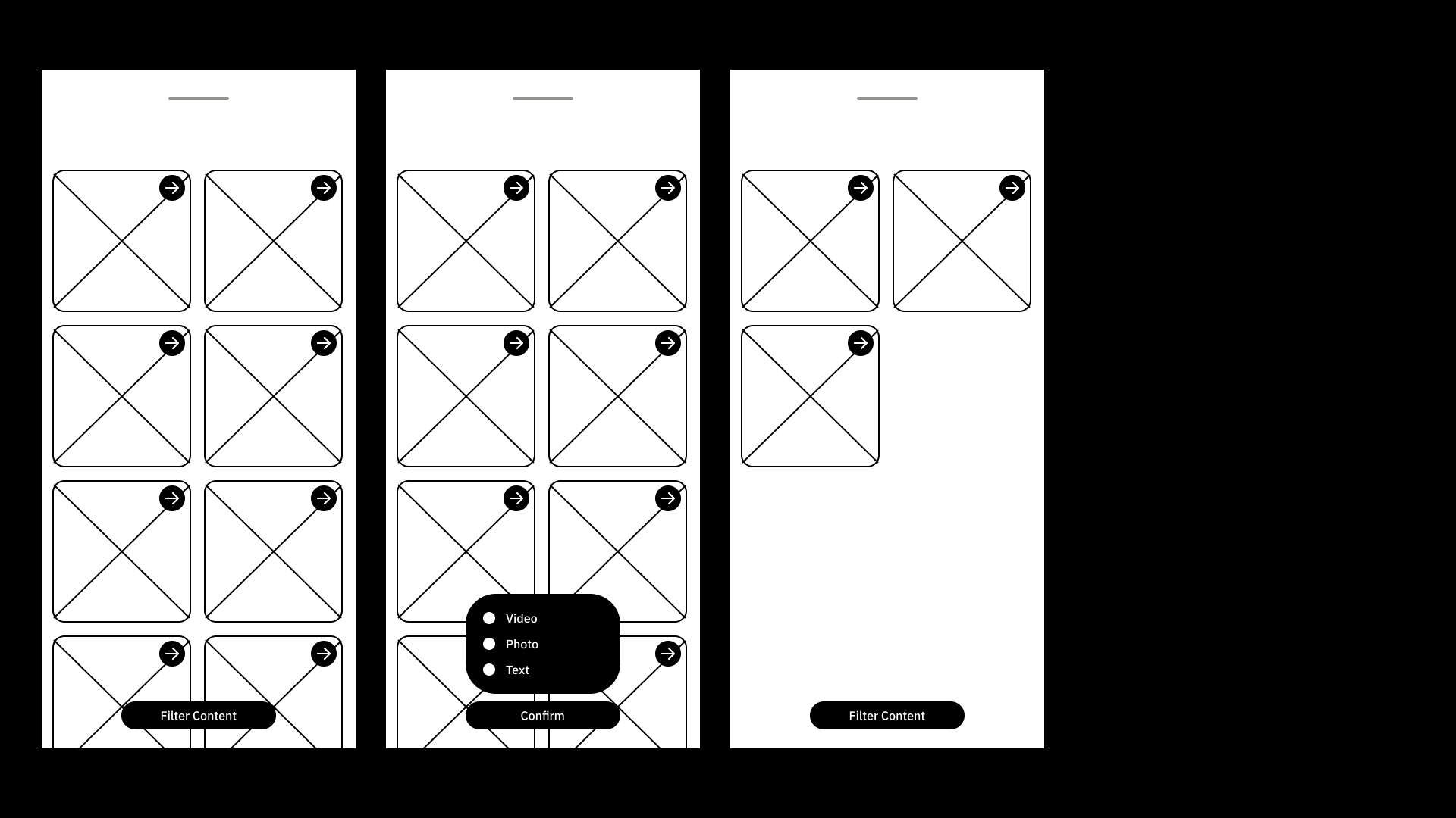
Content Filter
Content Filter
This gives the user the ability to narrow down the type of content they want to find.
03
Solution Three:
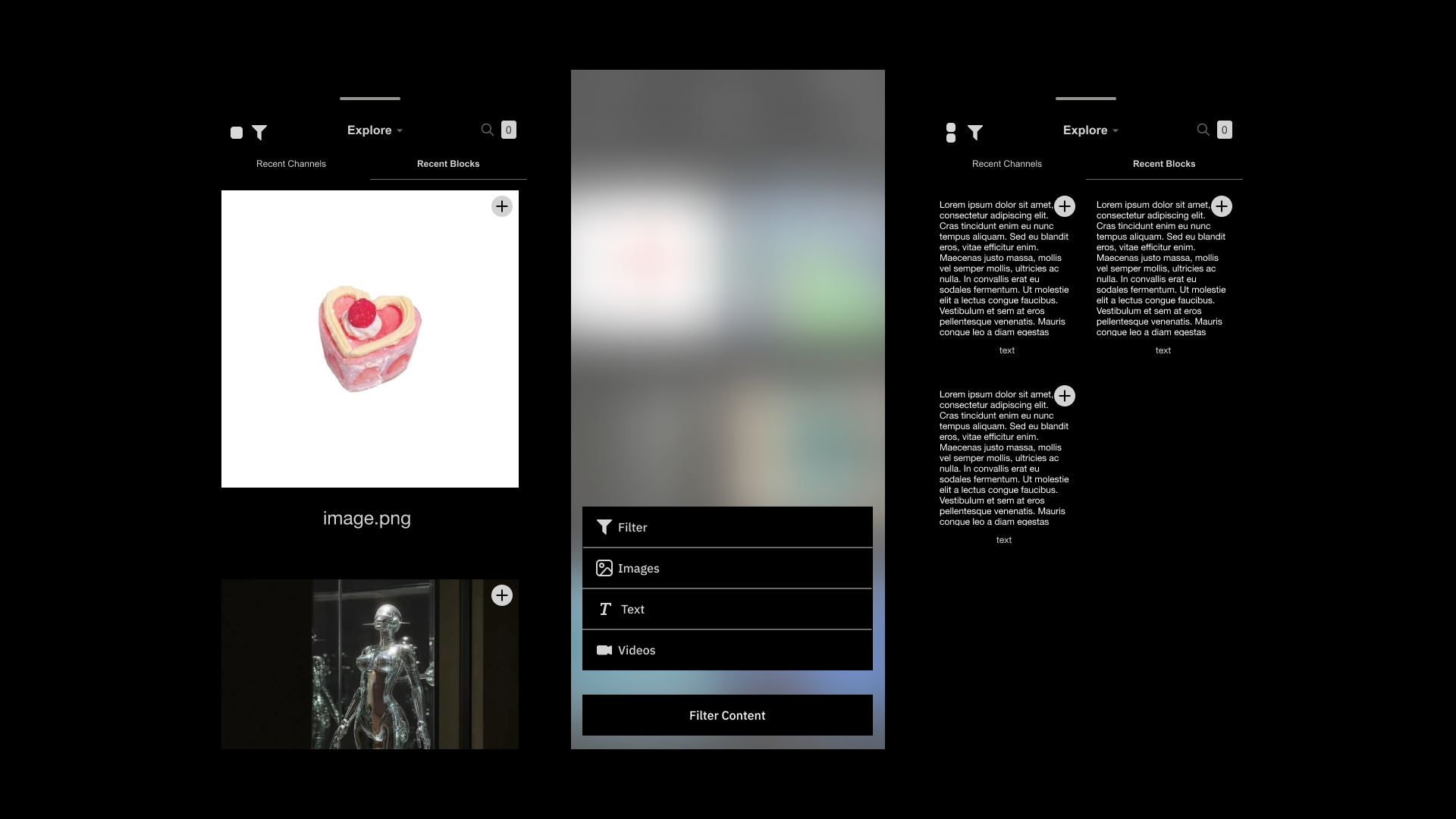
Direct Add To Board Button Flow
Direct Add To Board Button Flow
This gives the user the ability to narrow down the type of content they want to find.

High Fidelity Frames + Flows
01
Flow for resizing feed

02
Flow for filtering content
03
Flow for adding blocks into collection

Final Screens + Prototypes
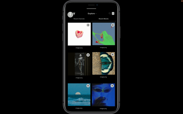
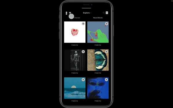
01 Grid Resize Button
Created a button that allows the user to switch from two column feed to one column for larger thumbnails.
Created a button that allows the user to switch from two column feed to one column for larger thumbnails.
02 Content Filter
Created a filter that allows user to get to the type of content they want more directly
Created a filter that allows user to get to the type of content they want more directly
03 Add to Collection Button
Removed obstacles in collection process by creating a add to collection button.
Removed obstacles in collection process by creating a add to collection button.
Reflections
01
The product design process, even with just revisions, is a lengthy and in-depth one! However, taking time to do each step individually helps create a cohesive product at the end.
This was my second time completing a UI/UX project on my own, so I felt liked this time around I had a better sense of how things were supposed to work. However, there were a lot of tasks that I had to complete in order to get to where I wanted.