Harvard Museum of Natural History
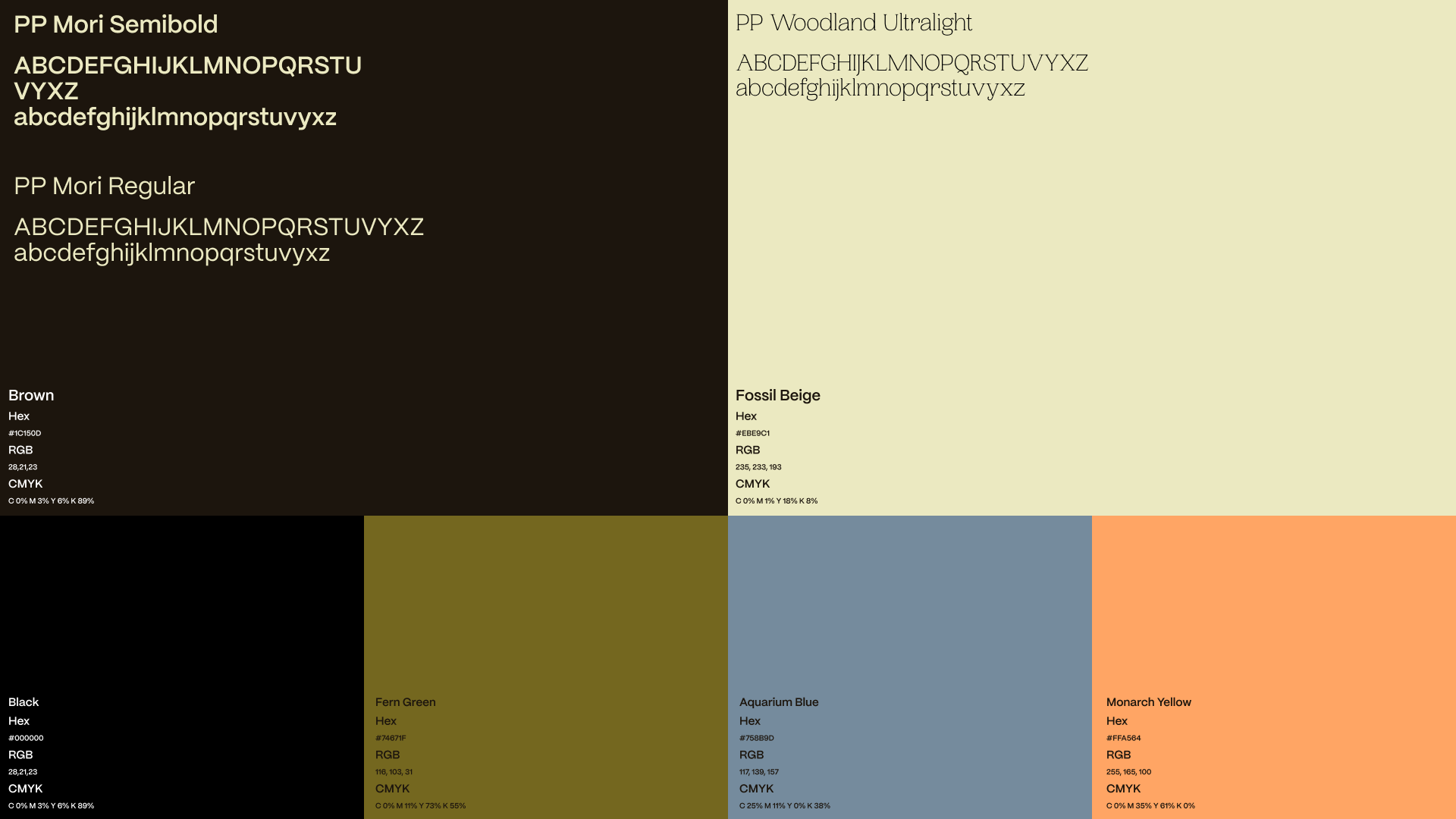
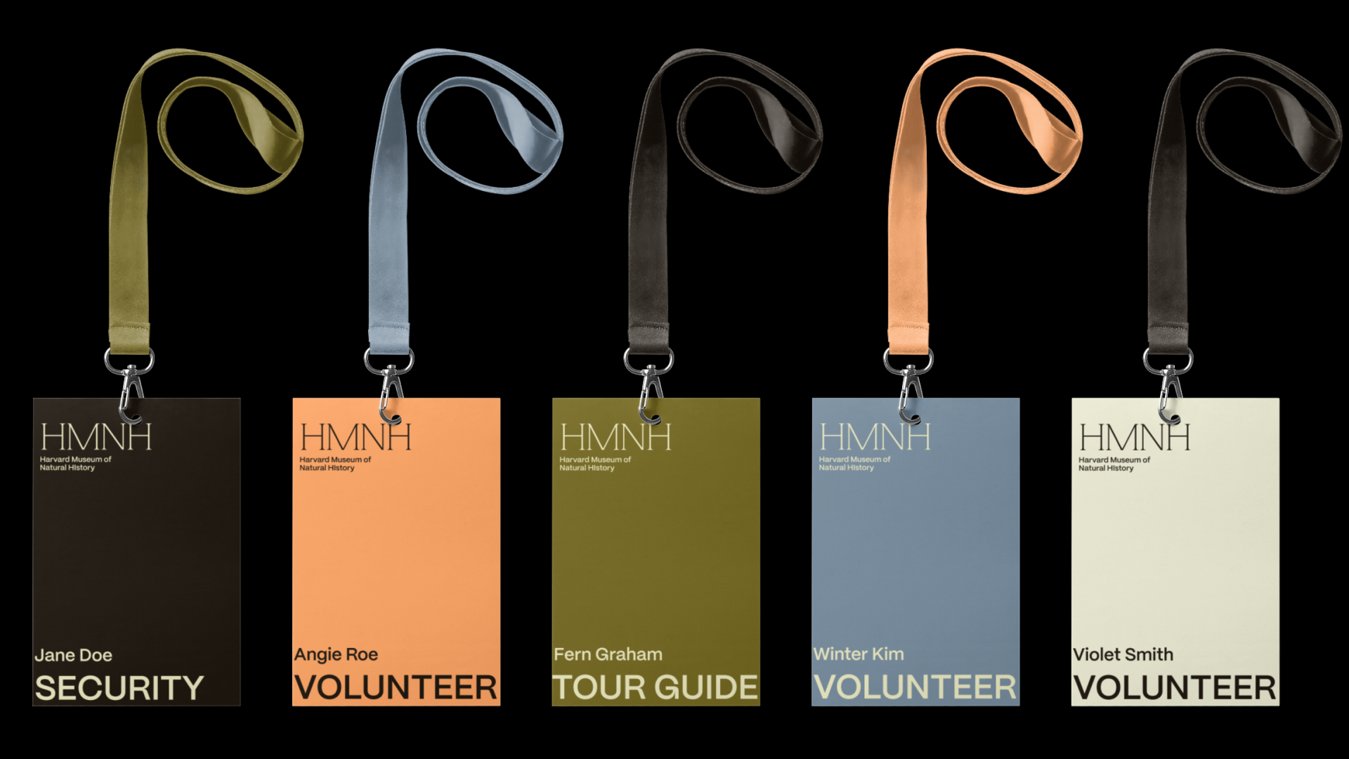
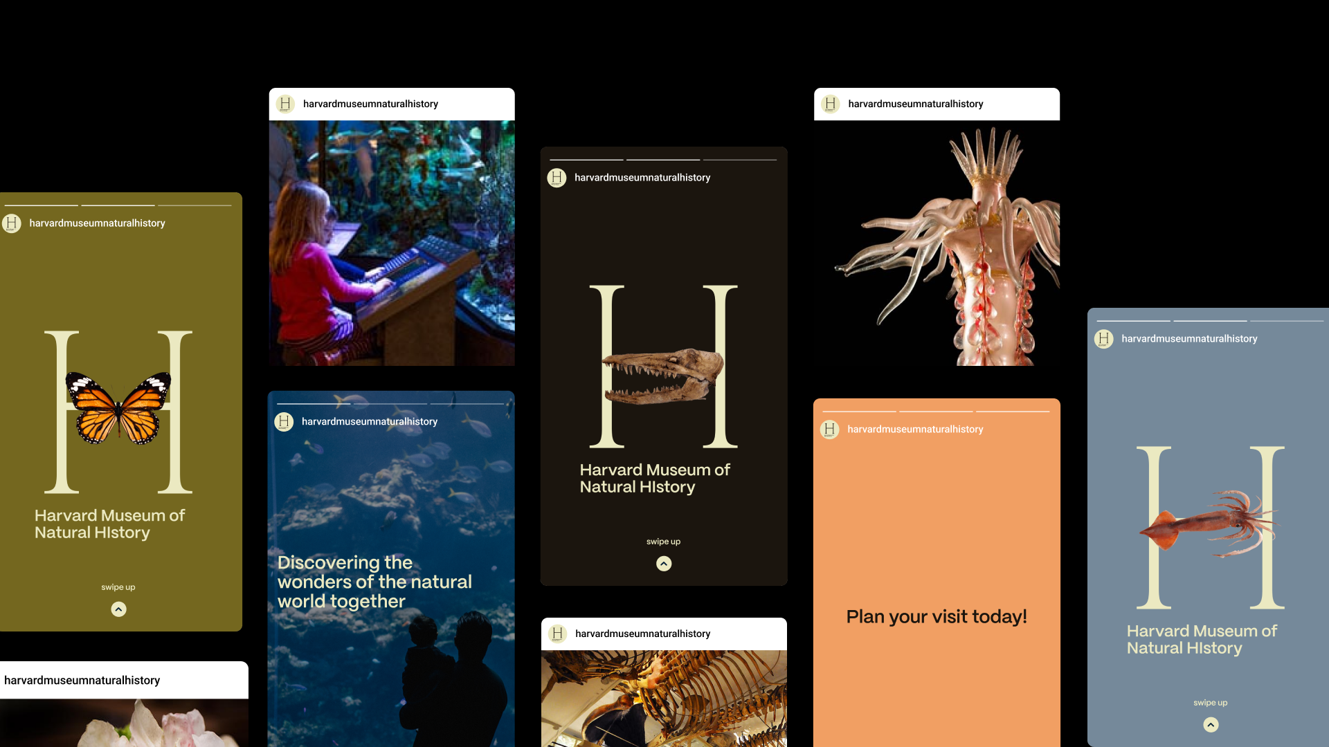
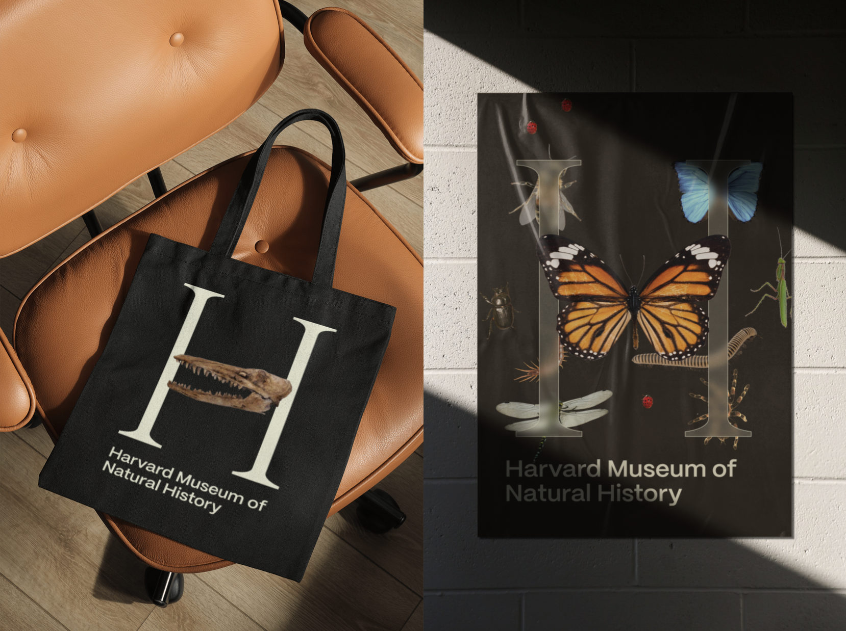
The rebrand for the Harvard Museum of Natural History serves to bring a more modernized and sophisticated feel compared to the previous logo. The color palette, as well as the fonts used, are inspired by the academic atmosphere and museum exhibitions.
Role:
Brand designer
Methods and Skills:
Art direction, brand research, brand design, Adobe Photoshop, Adobe Illustrator, Figma
Brand designer
Methods and Skills:
Art direction, brand research, brand design, Adobe Photoshop, Adobe Illustrator, Figma
How do we resonate with the scientifically curious youth while maintaining Harvard’s academic prestige?
The current logo for Harvard Museum of Natural History has it’s full name listed within a green square, with a notable exclamation point replacing the i in “history.” While meeting the minimum requirements to communicate the name of the museum, associate itself with nature by using a bright green, and communicate excitement about science with the exclamation point, the logo itself is overwhelming for the young and curious minds that the museum wants to attract and lacks opportunities to create a strong brand guide. Through this rebrand, I strived to create a logo that is less visually overwhelming through the use of acronyms and create a strong brand guide that can be applied to various deliverables.